New Interactive On-Line Data Map Pinpoints Tenant Displacement in NYC:
Displacement Alert Project Map Gives Activists and Policy Makers Key Information to Proactively Address the Tenant Displacement Crisis
The Association for Neighborhood and Housing Development (ANHD) with support from The Ford Foundation released the Displacement Alert Project Map (DAP Map), a building-by-building, web-based interactive map designed to show where residential tenants may be facing significant displacement pressures and where affordable apartments are most threatened across New York City. Tenant displacement is a growing crisis that is increasingly at the center of neighborhood concerns and City policy focus. The DAP Map is a key new tool that, for the first time, brings new information that local activists and policy makers have long needed.
View the DAP Map at: www.dapmapnyc.org
The DAP Map visualizes three data layers:
- Loss of rent-regulated units in the building
- Volume of NYC Department of Buildings permits that indicate a high rate of tenant turnover
- Level of building sales prices that indicate speculative building purchases
Displacement is a growing crisis, and neighborhood residents and activists want to know how market pressures and new housing development will impact neighborhoods’ existing affordable housing, and increase the displacement and harassment of tenants. But, there has been little data or useful information on where displacement is taking place, the level of displacement happening, the primary method of displacing tenants, and where organizer can proactively intervene to prevent displacement.
Some key data points from the DAP Map:
There are 96,000 multi-family buildings in the data set. They all had at least one indicator of potential displacement pressure: sold in 2015, at least one rent regulated unit since 2007, or had a residential DOB since 2013.
- There are 96,000 multi-family buildings in the data set. They all had at least one indicator of potential displacement concern: sold in 2015, at least one rent regulated unit since 2007, or had a residential DOB since 2013.
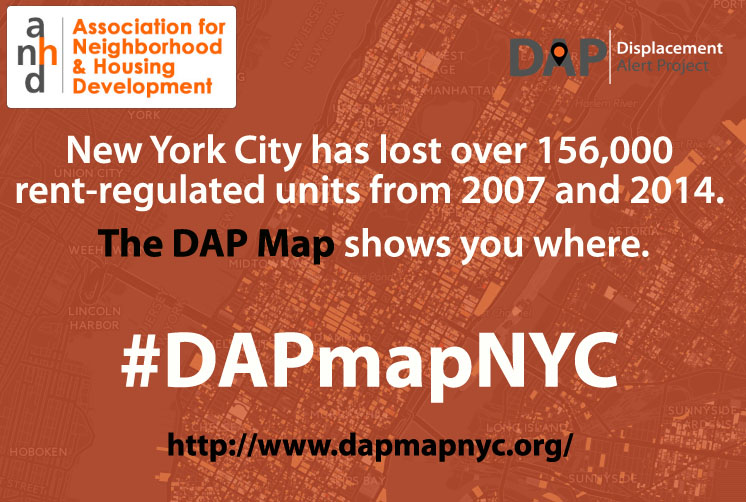
- New York City has lost over 156,000 rent-regulated units from 2007 to 2014.
- Nearly 26% of the buildings on the DAP Map have a high risk score, suggesting increasing rents.
- In over 5,400 buildings, the 2015 sales price per unit increased by more than double the 2010 area average.
- Just 10 zip codes account for one-quarter of all the buildings in NYC that lost a high percentage of rent regulated units between 2007 and 2014.
- Twenty-five zip codes account for one-half of all the NYC buildings that lost a high percentage of their rent regulated units in that same time period.
- In those same 25 zip codes, there is a correspondingly high number of Department of Buildings permits, with 16 of these zip codes showing exceptionally high DOB permit activity.
- In those same 25 zip codes, there is a correspondingly high number of exceptionally high per-unit property sale prices. In 12 of those zip codes, the average per-unit sale price was 150% above the average price in the surrounding area.
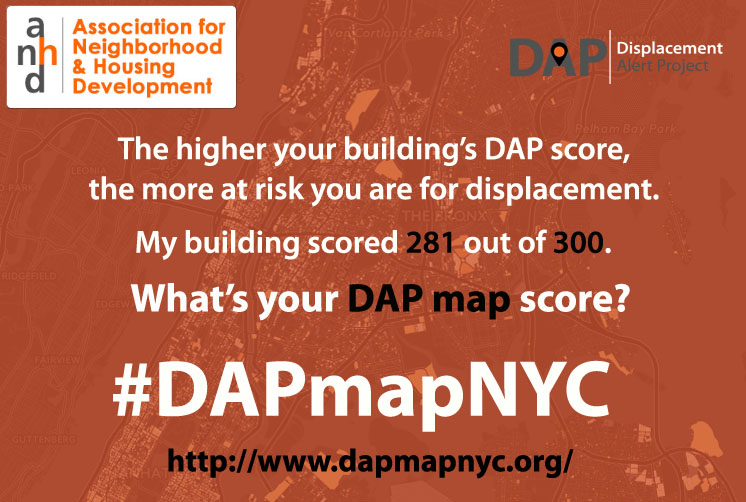
The DAP Map risk indicators score each risk factor on a scale of 100. The closer an individual building’s score is to 300, the greater the displacement risk. Buildings with only 1 indicator – i.e. only DOB permits, but no property sales and no loss of rent regulated units – can only score a high of 100 points.
The DAP Map is a strategic tool for tenants, community groups, and policy makers who want to address the growing crisis of displacement:
- Organizers can use the map to identify at-risk buildings and then provide proactive outreach and education to those tenants.
- Community groups can use the map to identify which neighborhoods might be experiencing a wave of displacement pressure.
- Policy activists can use the map to better understand what actions the government is taking or policies are in place to make the problem of displacement better or worse.
“The Displacement Alert Project Map (DAP Map) will be a dynamic tool in our fight against displacement here in the Lower East Side neighborhood where I work, and in other communities across the City. The DAP Map will help us to confirm and anticipate where displacement pressure is looming. The DAP Map has already shown us a correlation we’ve long understood exists around the loss of affordable housing in New York City – that high volumes of renovation and construction often goes hand-in-hand with the depletion of affordable, rent regulated housing, a fact that should inform the City policy discussion.” -Brandon Kielbasa, Director of Organizing at Cooper Square Committee
“New York’s housing crisis is made worse by compounding issues of inequality and segregation of neighborhoods. The data provided by the Association for Neighborhood and Housing Development’s Displacement Alert Project (DAP) Map will help address issues that disproportionately affect low-income New Yorkers and Black and Brown communities. I look forward to seeing the change that is implemented as a result of the information that is gleaned from the DAP Map.” -Council Member Jumaane D. Williams
With the passage of major new city-wide zoning rules this past spring, the Mayor also committed to passing a new city-wide anti-displacement program called a City-Wide Certificate of No Harassment. Information about the City-Wide Certificate of No Harassment policy can be found in this ANHD blog post.
Read the exclusive report about the DAP Map in this piece published in the New York Times – New Tool Shows New York Neighborhoods At Risk Of Rent Hikes
To learn more about the DAP Map, read our blog post.

Join the conversation online using the hashtag #DAPmapNYC and follow @ANHDNYC on Twitter.