New York City Councilmember Jumaane Williams, the Chair of the Housing Committee, and the Association for Neighborhood & Housing Development (ANHD) jointly released the latest edition of ANHD’s annual data graphic
2017 How is Affordable Housing Threatened in Your Neighborhood?
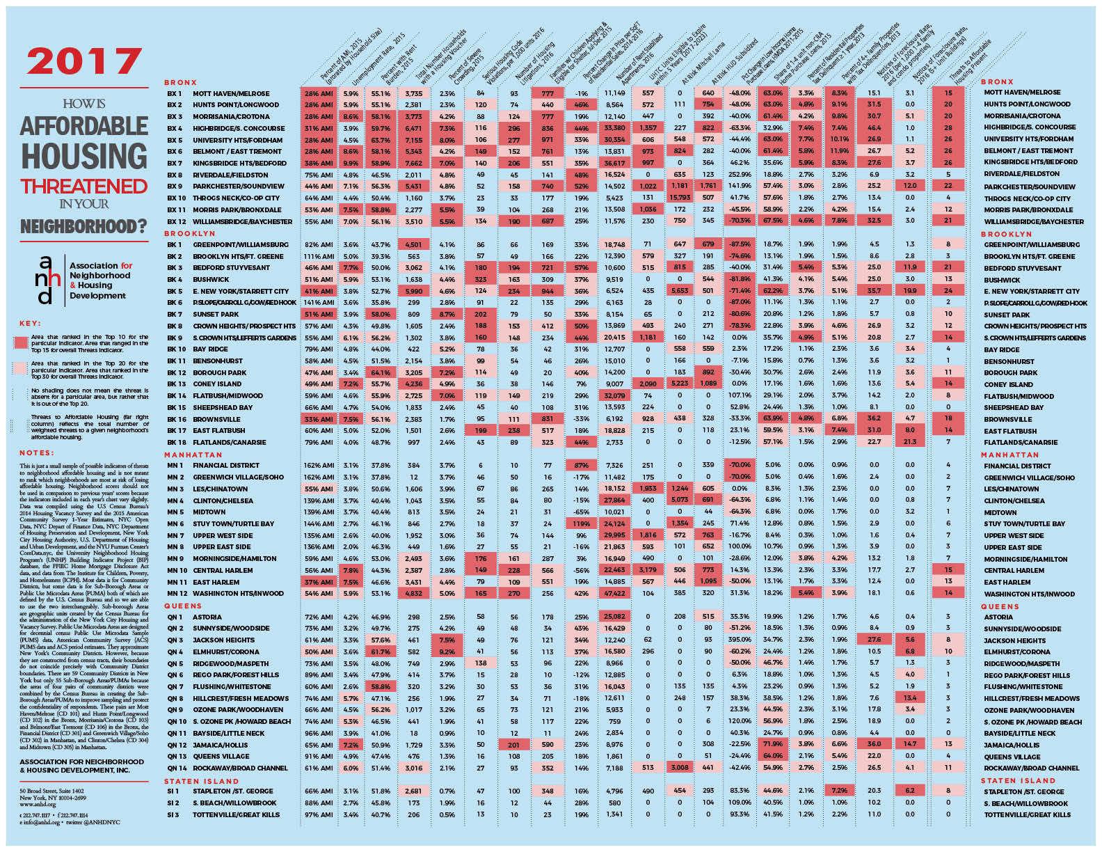
The affordable housing risk chart is released each year with a variety of indicators of key threats to affordable housing in our city, laid-out at a neighborhood-by-neighborhood level in a user-friendly visual format. The risk chart is designed to allow each reader to notice issues and patterns that are especially critical in their individual neighborhoods, as well as the City as a whole. The information is presented to help community groups and policy makers develop effective strategies to address the affordable housing crisis.
Click here to view a full size version of the chart.
One important trend in this year’s chart is the significant increase across many neighborhoods of Percent with Severe Overcrowding. An increase in overcrowding captures families that are doubling- and tripling-up in order to afford their rent and is often a precursor to an increase in shelter applications.
- The percent of severely overcrowded families in the Kingsbridge Heights section of the Bronx was 0%, which is a 32% increase from the previous year.
- In Sunset Park, Brooklyn, the percent of severely overcrowded families was 7%, which is a 10.1% increase from the previous year.
The numbers may tell more than one story. For example, the Crown Heights neighborhood of Brooklyn had 2.4 % of families severely overcrowded, a 36.8% decrease over/from the previous year. This could indicate that overcrowding in that neighborhood is decreasing for every demographic, or it could mean that the influx of newer, wealthier residents is decreasing overall overcrowding.
However, the city-wide percentage of severely overcrowded families increased by 18% over the previous year.
“The increase of neighborhoods – with the often under-reported and uncounted overcrowding – draws attention to an important condition that is typically overlooked in the overall conversation of the city’s housing crisis,” said Council Member Jumaane D. Williams. “When we talk about homelessness and a lack of affordable housing – which is a problematic subjective term within itself – we often forget to think of the households where families are doubling and tripling up to afford rent. This is an issue that spans all demographics. For example, it’s not uncommon to have 3 or 4 young professionals living together in a small apartment to afford rent in this city. Not only is this not practical, but it’s also unsafe. My hope is that these figures help paint a true picture of what life is like for many people in this city, and help create income-targeted housing for all.”
“Severe overcrowding is the underwater portion of the homelessness iceberg – we can see the increasing number of New Yorkers in shelters, but we can’t always see immense and growing crisis of affordability that puts them there. For a family, severe overcrowding often comes a step before a shelter application when they are evicted from their apartment and spend a period doubled-up while they exhaust their affordable housing sesarch options” said Benjamin Dulchin, the Executive Director of the Association for Neighborhood and Housing Devleopment. “This year’s Housing Risk Chart shows the many ways and many neighborhoods where City policy must do a better job preserving our affordable housing.”
The 2017 Housing Risk Chart illustrates where NYC’s neighborhoods continue to face threats to affordable housing. The chart captures some of the drivers behind increased displacement and the on-going housing crisis.
Other interesting data trends from the affordable housing risk chart include:
- The Number of Housing Litigations numbers show many neighborhoods where tenant displacement pressure is most severe.
- Highbridge/South Concourse of the Bronx had the highest number of housing litigations in 2016 with 296.
- The Percentage Change in Residential Sales per Square Foot also shows where speculative market pressure is increasing. (See more on this at the building-by-building level detail on ANHD’s Displacement Alert Project Map at dapmapnyc.org.)
- Stuy Town/Turtle Bay in Manhattan had the highest percentage change from 2014 to 2016 with 119%.
- The Total Number of Housing Vouchers was added this year to capture the potential threat Federal budget cuts could present to the numerous families with housing vouchers.
- 25 of the City’s Community Districts each have more than 2,000 families receiving a housing voucher.
 ANHD 2016 Building the Community Development Movement


